


Hi everyone! Dani here, Head of Design at Stemma. In this post, I’ll be going deep into the changes we’ve been making within the Stemma interface to decrease frustration when debugging data issues, establish best practices within data teams, and make discovering existing data easier for data scientists and analysts.
We’ve been rolling out these changes bit-by-bit to existing Stemma customers to get feedback early and often. The folks at SoFi, Convoy and Workrise (just to name a few) have been especially helpful in ensuring that the changes we’ve made not only improve the look-and-feel of Stemma but also solve real problems data teams face day-to-day.
As we walk through the changes to our core features, I’ll be calling out the design philosophy and research behind them. So let’s dive in…
Decreasing frustration when debugging data issues
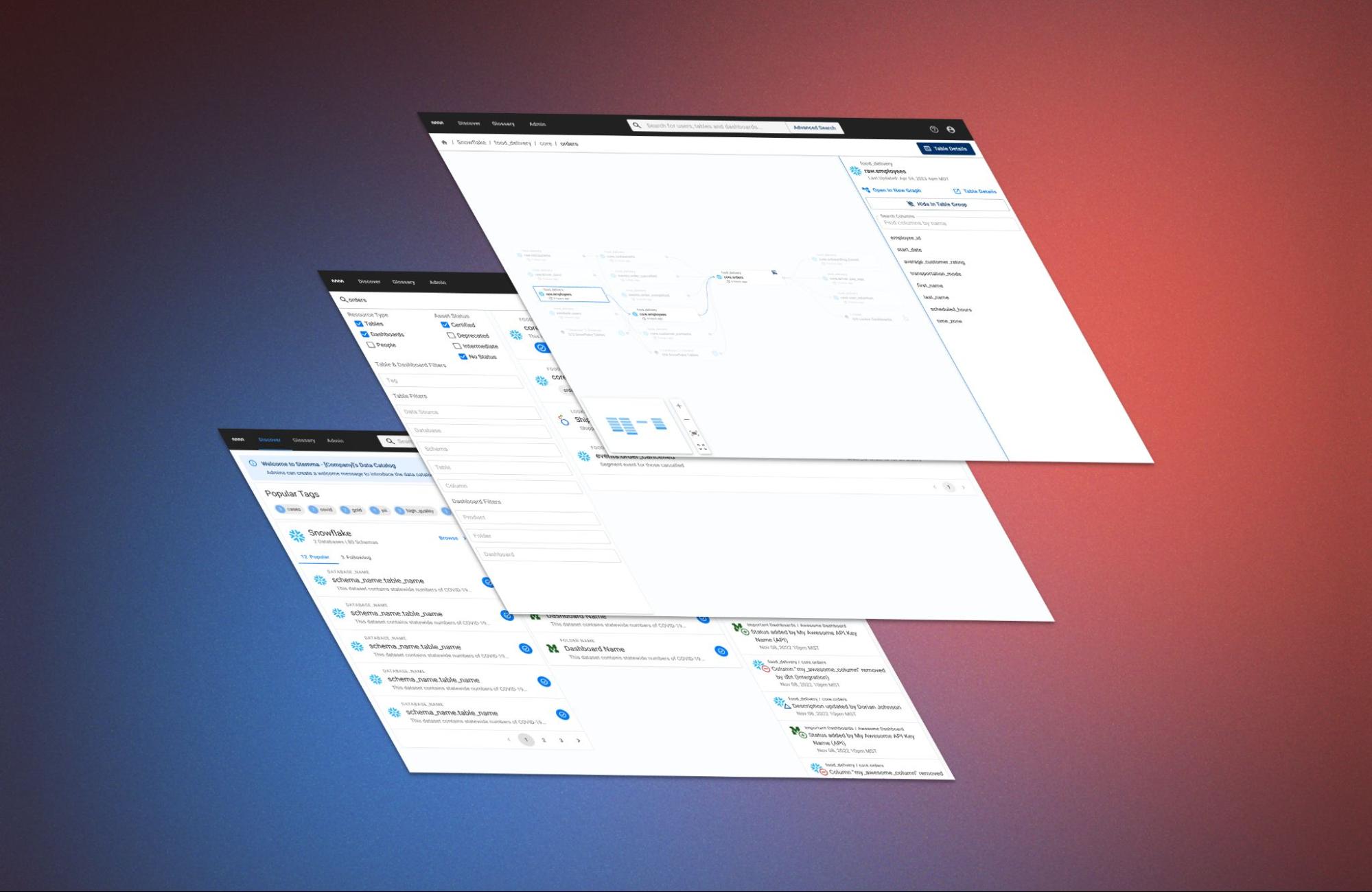
Let’s start with an interface that feels particularly tied to data catalogs, the lineage graph. This collection of nodes, edges and metadata is a staple of our product category and helps with a variety of situations. Whether you are planning a change to a column or trying to understand what somebody else changed, the lineage graph provides a shared source of truth for how data feeds into your company’s dashboards and machine learning models
Despite their ubiquity, lineage graphs have a serious problem in most real world situations. Most lineage graphs, including Stemma’s original design, resemble diagrams that were originally designed for other use cases. While directed acyclic graphs (DAGs) might be helpful in describing Airflow jobs and ETL pipelines, they fall over when trying to render lineage. Real-world lineages often have dependency loops and a DAG is unable to handle those in a way that’s easy to understand. Similarly, Entity Relationship Diagrams (ERDs) - with lines showing relationships across all columns and tables at once - can be overwhelming when trying to trace the origin of a single table or dashboard.
We talked to dozens of users about the way they use the lineage graph, in Stemma and in other tools, and we found that the DAG-like interface we had wasn’t that helpful when trying to debug a broken dashboard or when attempting to understand the logic behind a particular table. Despite having access to a lineage graph in various tools within the modern data stack, our users were reporting that they rarely used them (and our metrics were showing the same). Instead, they used source control to piece together the lineage on their own.
I never used the old lineage graphs. Instead, I would scroll through the hundreds of SQL files that we had. I was used to it and comfortable with it, but it did take time.
~ A Data Scientist reflecting on how they debugged problems before the lineage graph updates
So we backed away from the DAG and tested multiple versions of the graph, with varying levels of information density, to determine what metadata and connections really mattered during those critical moments when a dashboard goes down.
Here’s what we found:
- Changes to a column are the most frequent changes. The second most frequent change, table deprecations, happened significantly less often
- Filtering by a chart or query can help debug dashboard issues faster. Filtering by chart can help figure out the impact of a change to all affected downstream tables and dashboards
- It’s not just the direct connections that matter, but the nodes furthest upstream and downstream that help when debugging or planning a change
- “Last updated” and “popularity” are extremely useful in understanding what broke or what to prioritize when planning changes
- Other metadata, like the Owner or type of SQL transformation, is not as important and doesn’t need to be shown at all times
In Stemma’s latest iteration of the graph, these findings have been put to use in a layout that is much easier to navigate - even in the most stressful situations - getting out of your way when necessary, and showing the right amount of detail at the right time.
Compared to other lineage graphs in the modern data stack, whose usability significantly decreases when dealing with real world data, we’ve found that Stemma’s graph can handle huge tables with hundreds of columns and connections.
With this novel approach to showing data, users can quickly parse the graph and leverage it for complex analysis - no exporting required.
Making discovering existing data easier for data scientists and analysts
Let’s step back - outside of the lineage - and take a moment to remember the first time we had to work with a new dataset. Perhaps you just joined a new company, or are starting a project with an unfamiliar part of the organization (like finance or ops), or maybe a new product just launched. Across experience levels, the data analysts we talked to mentioned “getting their bearings” as the primary reason they use a data catalog.
The previous Stemma homepage wasn’t very helpful in this situation. If you happened to know enough about what you were looking for, you could maybe type in a search or click on a familiar table and work your way to an answer via the lineage. But for new members of the data team - or someone just learning a new area of the business - this wasn’t enough.
So, over the course of a few months and a half-a-dozen iterations, we developed the Discover page - Stemma’s new homepage:
A new introductory message can be added by admins to help new users get familiar with what’s in the catalog. After talking to Stemma admins across our user base, we were frequently asked for a space to link to important assets, common tools and introductory images. This simple info-box at the top of the home page is our first step in addressing that feedback.
The goal of this new home page is to get users of all levels to an answer quickly. Popular tags and assets can also help folks who are unfamiliar with the full breadth of a company’s catalog by giving them a place to start their search. Meanwhile the brand new “Browse” experience helps those already familiar with their data stack get to specific tables and dashboards more quickly.
Look familiar? It should! We know that most users of Stemma also use tools like Snowflake, Redshift, Mode and many others that use tree views to communicate the many layers of hierarchy within a data source. In accordance with Jakob’s Law, we brought that same, intuitive interface to Stemma. We’re not afraid of “not invented here.” Instead, we choose the right tool for the job.
Search also got a facelift - with better auto-complete in the navbar, more reactive filters, and clearer explanations for why a result is appearing in the search:
Centering our users in everything we do
Whew! That’s a lot of changes. But it’s only about half of the improvements we’ve made to the Stemma interface over the last few months. Supported by user research and the Stemma team’s deep knowledge of the modern data ecosystem, I’m excited to see how the growing number of Stemma users react to what we’ve built.
Keep an eye out for the next post which will cover the latest updates to the table and dashboard details pages, business glossary and the API. I’ll also be sharing a bit about our user research practices and how they help make designing everything at Stemma - including the API - more user-centered.
Until next time!
Read Part
2