ConveyUX 2018 — Day 2 (Opening and More)
Published on Mar 1, 2018
Yesterday, I posted my 5-point summary of every talk I attended at ConveyUX— currently taking place in Seattle, WA. Today, I will be sharing my notes from Day 2 (Feb 28).
The Architecture of Understanding
Presented by: Peter Morville
People have lost track of the truth, can be easily misled, and believe what they want.
- In his early career, Peter wanted to organize information so people could find what they need. As he (and the field) grew, he began to realize that “everything is connected from code to culture”
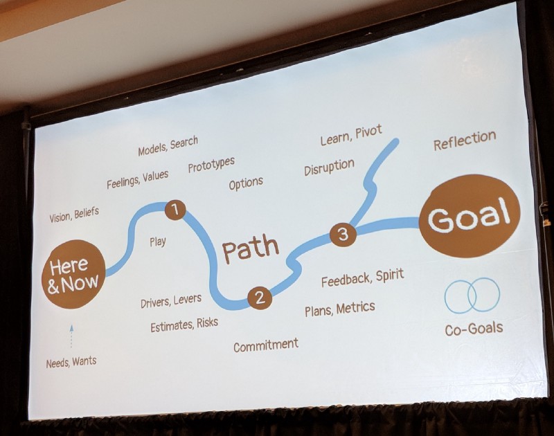
- As seen in the Cognitive Psychology of Planning (2005), those who plan ahead tend to stop planning once they begin a task. Those who plan concurrently are the ones who succeed.
- Concurrent planning strategies can be remembered through the anagram, STAR FINDER…
Social — generate ideas with people
Tangible — get the ideas out into the real world
Agile — plan for disruption
Reflective — Question everything
Framing — how we understand and explain our plans
Imagining —expands the (awareness of) paths and possibilities
Narrowing — evaluating (and filtering) of paths and options
Deciding — committing to (and communicating) a path or goal
Executing — an improv of dance, listen, learn and lead
Reflecting — insight by intent; reflection changes direction
- To address dark patterns, UXers must have the courage and internal ethics to stand up for what’s right. Goals and metrics are important but they can be dangerous.
- The same tools we use to design paths can be used to question our (or our company’s) goals.
 Using evaluative techniques to investigate the paths to goals
Curiosity, Skepticism, Humility: Achieving the right mindset for design discovery
Presented by: Dan Brown
Sometimes adopting a mindset means going against the grain of your personality… you can’t grow without making yourself uncomfortable.
- Our mindset is what translates our perceptions into actions. When something happens, we Perceive it, Understand it and Choose what to do… this may lead us to Act.
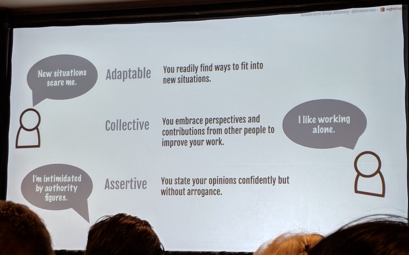
- To be Adaptable, change the technique and replace it with something that maintains the spirit of the Discovery plan.
- To be Assertive, be transparent with the current knowledge (or lack thereof) and move forward with the information you have available.
- To be Skeptical, list the assumptions you and your team may have and play devil’s advocate to uncover more questions to ask.
- To be Humble, say “I don’t know” and invite others to give you feedback as often as you can.
 Dan explains how his own personality runs up against his recommended behaviors for Discovery
Using Data Science to Quantify User Journeys
Presented by: Sam Zaiss
The data doesn’t know which paths are valuable and the actual user journey can stray from the “golden paths”
- Collaboration between Data Science and User Experience disciplines tends to be hindered by a lexical barrier. By sharing information and data instead of just insights, we can come together with shared insights.
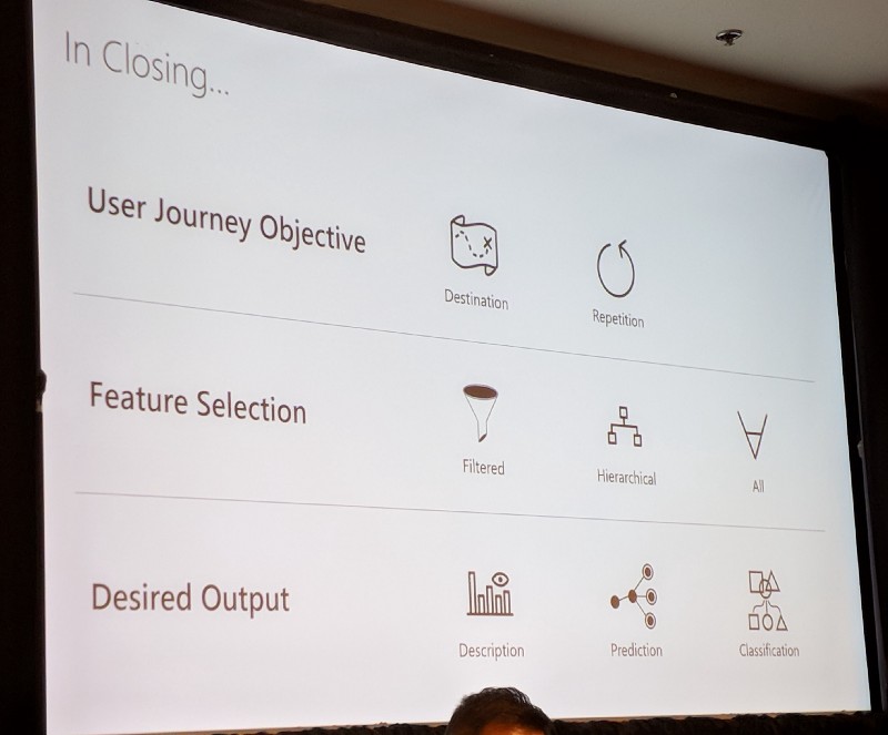
- Triangulation is not enough… A shared framework can be used to communicate user journeys between fields: Objective, Feature Selection and Desired Output
- Objectives vary between Destination (user should navigate from point A to point B) and Repetition (user should use the same feature over and over)
- Feature Selection can vary between Filtered and Hierarchical or combine All the data within an analysis.
- Desired Outputs will depend on the Objective and Feature Selection and will land somewhere among Descriptive, Predictive, or Classification-based models.
 Sam’s framework for DS and UXR collaboration
Professional Grade: Designing enterprise interfaces with the expert user in mind
Presented by: Kams Thorum
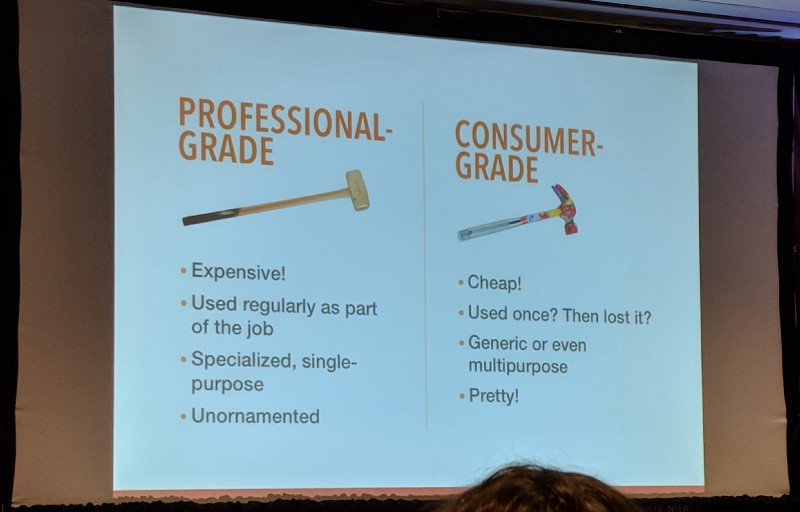
We’re trying to use consumer-grade patterns in a professional-grade product
- At a certain point in the range between “Consumer Grade” and “Expert Grade” products, the users and your customers are two (or more!) completely different people.
- When designing for enterprise users, TASK IS KIND and user delight comes from efficiency. Usability trumps consistency and aesthetics should be used as a tool.
- When designing for expert users, you MUST do user research. Make your product configurable and start small to “get it right”.
- Present sufficient information for a user to complete their task. To prevent them from falling into inaccessible workflows, present more complicated workflows with terms that only expert users will recognize.
- Experts hate training… so explain functionality within the interface or provide a learning mode that can be easily skipped or ignored.
 The difference between professional-grade and consumer-grade products
That’s it for Day 2! It’s been a great conference so far and I can’t wait to see what’s in store for tomorrow.
Thanks to all the presenters (and I’m sorry if I totally misquoted you)! If you attended the conference, do you have any notes to share? If you attended the same sessions as me, do you agree with my key takeaways? What did I miss?
Comments always appreciated!
Dani

