Rebuilding my site with web standards - Part 2
Published on Jun 16, 2020
Intro
In this series, I walk through the steps (and tools) it took to…
- Research a tech stack that made it easy to comply to web standards
- Get Hugo up and running and styling the home page (this post)
- Migrate my blog from Medium and my portfolio from my old site
- Style the blog and portfolio using SCSS
- Design and build out the portfolio browsing experience
- Migrate the only dynamic content on my site, the “I am…” page
- Deploy to netlify, set up DNS and redirect rules
- (Cross-)Post content on others’ sites and get feedback on drafts
A Hugo “Hello World”
Hugo has a great Quick Start guide that lets you copy and paste commands into your terminal to get started. Broken down into 7 steps, the guide only requires you to make one choice… A THEME
Although the guide uses the Ananke theme as an example, I found myself wary of using a theme that would force me to understand somebody else’s styling and possibly undo their work to make my site look the way I wanted.
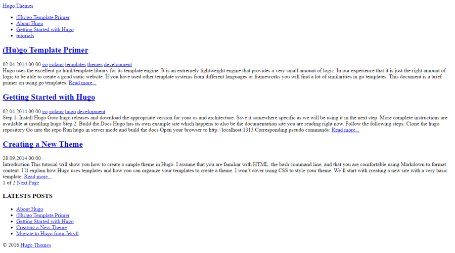
So I started from scratch with the blank theme.

I later found out that hugo doesn’t require you to use a theme at all and, instead will look for the same folders that a theme might provide (layouts, static, etc.) in your root folder, if no theme is configured (docs).
Themes are essentially a way to encapsulate the content-agnostic code for your site into its own tidy directory.
From zero to hero: the home page (S)CSS
Pretty much everything I write and release with my name on it is made with two fonts: Raleway and Merriweather. So, of course, the first thing I did was add those fonts to the page:
Code to enable fonts in baseof layout
<!-- baseof.html -->
  <link href="https://fonts.googleapis.com/css?family=Raleway" rel="stylesheet">
  <link href="https://fonts.googleapis.com/css?family=Merriweather" rel="stylesheet">
Code to enable fonts in main.scss
/* main.scss */
body {
    font-family: 'Merriweather', serif;
}


h1, h2, h3, h4, h5, h6 {
    font-family: 'Raleway', sans-serif;
}
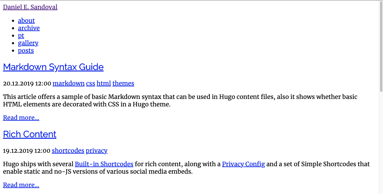
The new “blank” theme:

I also added SCSS support (more info):
Code to enable SCSS
<!-- baseof.html -->
  {{- $sassOptions := dict "targetPath" "assets/css/main.css" -}}

  {{- if (eq (getenv "HUGO_ENV") "production") -}}
    {{- $sassOptions = merge $sassOptions (dict "outputStyle" "compressed") -}}
  {{- else -}}
    {{- $sassOptions = merge $sassOptions (dict "enableSourceMap" true) -}}
  {{- end -}}

  {{- $style := resources.Get "css/main.scss" | toCSS $sassOptions -}}

  {{- if (eq (getenv "HUGO_ENV") "production") -}}
    {{- $style = $style | postCSS | fingerprint -}}
  {{- end }}

  <link rel="stylesheet" type="text/css" href="{{ $style.Permalink }}">
// postcss.config.js
module.exports = {
plugins: {
autoprefixer: {
browsers: [
"last 2 versions",
"Explorer >= 8",
]
}
},
}The content you see in the screenshot, above, is the default theme content. My next step was to re-add the content from my original site. First, the header and my color palette:
HTML content for header component
<!-- layouts/partials/header.html -->
<header>
	<a class="logo-nav" href="{{ .Site.BaseURL }}">
		<img src="/img/logo.png" />
	</a>
	<nav>
		<div class="site-title">{{ .Site.Title }}</div>
		{{ with .Site.Menus.main }}
		<ul>
			{{ range . }}
			<li><a href="{{ .URL | relURL }}">{{ .Name }}</a></li>
			{{ end }}
		</ul>
		{{ end }}
	</nav>
</header>
The CSS is broken up into two files:
/* main.scss */
@import "layout/index.scss";
@import "components/header.scss";
index.scss
/* layout/index.scss  */
@import "../tokens.scss";

html {
    background: $color-background-dark;
    box-sizing: border-box;
    color: $color-font;
}

*, *:before, *:after {
    box-sizing: inherit;
}

body {
    font-family: $font-paragraph;
}

h1, h2, h3, h4, h5, h6 {
    font-family: $font-heading;
}

a {
    color: $color-primary;

    &:hover, &:focus {
        color: $color-secondary;
    }
}

main {
    margin-top: 7em;
}
header.scss
/* components/header.scss */
@import "../tokens.scss";

header {
    display: flex;
    position: fixed;
    z-index: $elevation-header;

    align-items: center;
    top: 0;
    left: 0;
    width: 100%;

    padding: 0.5em;

    background-color: $color-header-background;
    @include elevation(4);

    .logo-nav {
        img {
            width: 4.5em;
            height: auto;
            margin: 0 0.45em 0 0.2em;
        }
    }

    .site-title {
        font-family: $font-heading;
        font-weight: 700;
        font-size: 1.7rem;
        letter-spacing: 0.018rem;
        padding-left: 0.15em;
    }

    nav {
        display: flex;
        flex-direction: column;

        ul {
            display: inline-block;
            list-style: none;
            margin: 0;
            margin-left: -0.15em;
            padding: 0.6em 0;
        }

        li {
            display: inline;
            padding: 0.25em 0.45em;

            a {
                font-family: $font-heading;
                letter-spacing: 0.024rem;
                text-transform: uppercase;
                text-decoration: none;
            }
        }
    }
}
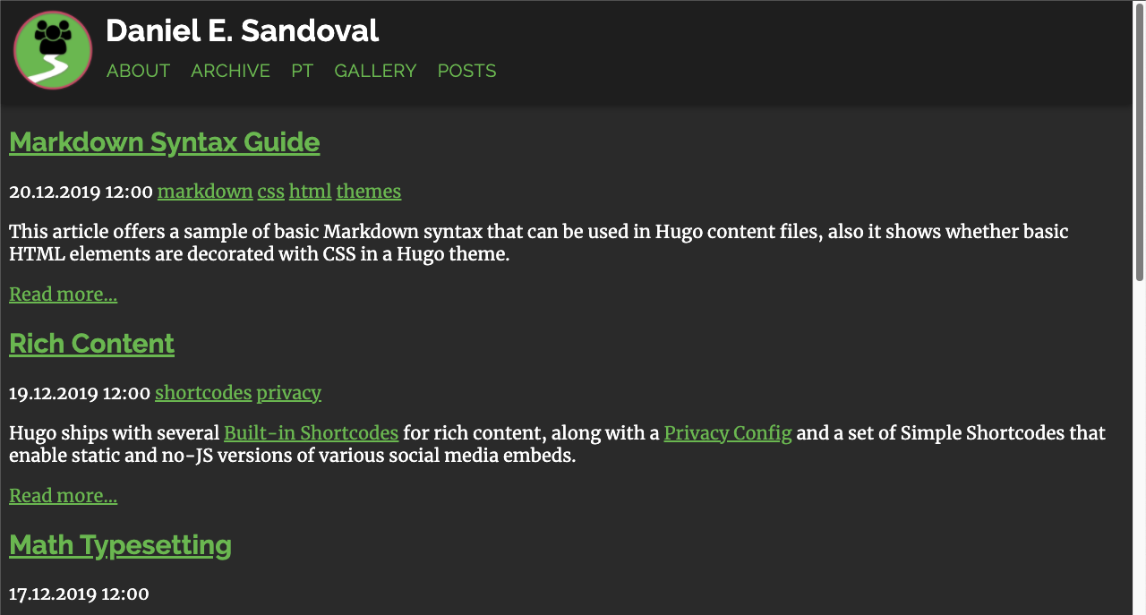
Here’s the header:

I decided to use SCSS variables to make it easy to modify things across the site with very small changes. This let me experiment with things, later on, like deciding which font to use for the lower-heirarchy headers (like h4-h6).
Also note the use of semantic html within the header component and styles. This makes it easy for screen readers to digest the page. Add to that auto-generated navigation using hugo’s templating syntax and we’re left with a very minimal code base.
Copying over the content from my old site, I added in some CSS Grid, with fallbacks (and normalize.scss) for older browsers and mobile layouts:
Home page layout
```html ```Sidebar component
<!-- layouts/partials/sidebar.html -->
<aside>
	<section class="profile">
		<img src="/img/profile-purple.jpg" />
		<div class="info">
			<h1 class="name">Dani<br/><a href="https://dev.to/DreaminDani" target="_blank"  rel="noopener noreferrer">@DreaminDani</a></h1>
			<h2 class="job">Product Designer</h2>
			<h3 class="company">Pivotal Labs (VMware)</h3>
			<h4 class="location">Cambridge, MA</h4>
		</div>
	</section>
</aside>
Honors component
<!-- layouts/partials/honors.html -->
<section class="honors">
    <h2>Honors</h2>
    <div class="honors-list">
        {{ range .Site.Data.honors }}
        <div class="honor-item">
            <a href="url" target="_blank" rel="noopener noreferrer">
                <img src="{{ .logo }}" alt="{{ .organization }} logo" />
                <h2>{{ .title }}</h2>
                <h3>{{ .organization }}</h3>
            </a>
            <p>{{ .description }}</p>
        </div>
        {{ end }}
    </div>
</section>
As before, the SCSS files are broken out for maintainability:
/* main.scss */
@import "lib/normalize.scss";

@import "layout/index.scss";

@import "components/header.scss";
@import "components/honors.scss";
@import "components/sidebar.scss";
Homepage/global styles
/* layout/index.scss */
@import "../lib/tokens.scss";

html {
    background: $color-background-dark;
    color: $color-font;

    // prettify fonts: https://developer.mozilla.org/en-US/docs/Web/CSS/font-smooth
    -webkit-font-smoothing: antialiased;
    -moz-osx-font-smoothing: grayscale;
}

body {
    font-family: $font-paragraph;

    padding: 0 40px;
    max-width: 1080px;
    margin: 0 auto;

    display: grid;
    grid-template-columns: 3fr 1fr;
    grid-gap: 60px;
    align-items: start;

    main {
        grid-column: 1;
        margin-top: 7em;
    }

    aside {
        margin-top: 7em;
    }

    footer {
        grid-column: 1 / auto;
    }

    section.honors {
        grid-column: 1 / span 2;

        width: 100vw;
        position: relative;
        left: 50%;
        right: 50%;
        margin-left: -50vw;
        margin-right: -50vw;
    }

    @media #{$breakpoint-mobile} {
        grid-gap: 8px;

        main {
            grid-column: 1 / span 2;
        }
        aside {
            margin-top: 24px;
            grid-row: 2;
        }
    }
}

h1 {
    font-family: $font-heading;
}

h2, h3, h4, h5, h6 {
    font-weight: 400;
    font-family: $font-heading;
}

p {
    font-size: 0.95rem;
    line-height: 1.5;
}

a {
    color: $color-primary;
    text-decoration: none;

    &:hover, &:focus {
        color: $color-secondary;
    }
}
Sidebar styles
/* components/sidebar.scss */
aside {
    .profile {
        img {
            border-radius: 50%;
            width: 100%;
            height: auto;

            // fallback for non-grid browsers
            max-width: 200px;
            @supports (display: grid) {
                max-width: unset;
            }
        }

        .info {
            & > * {
                margin: 0;
            }

            .name {
                margin: 8px 0;
                line-height: 1;
            }
            .job {
                margin-bottom: 4px;
            }
        }
    }

    @media #{$breakpoint-mobile} {
        .profile {
            img {
                max-width: 200px;

                display: block;
                float: left;
                margin-right: 0.87em;
            }

            .info {
                display: inline-block;

                h1 {
                    padding-top: 0.4em;
                }
            }
        }
    }
}
Honors styles
/* components/honors.scss */
.honors {
    margin-top: 60px;

    > h2 {
        font-size: 2em;
        margin: 0;
        margin-left: 80px;
        border-bottom: 1px solid rgba(255, 255, 255, 0.8);

        @media #{$breakpoint-tablet} {
            margin-left: 40px;
        }
    }

    .honors-list {
        display: flex;
        padding: 0 80px;
        overflow-x: scroll;
        scroll-padding: 0 50%;
        scroll-snap-type: x mandatory;

        /* Horizontal Scroll Indicator */
        background-image: linear-gradient(to right, $color-background-dark, $color-background-dark), linear-gradient(to right, $color-background-dark, $color-background-dark), linear-gradient(to right, rgba(0, 0, 20, .87), rgba(255, 255, 255, 0)), linear-gradient(to left, rgba(0, 0, 20, .87), rgba(255, 255, 255, 0));
        /* Shadows */
        /* Shadow covers */
        background-position: left center, right center, left center, right center;
        background-repeat: no-repeat;
        background-color: $color-background-dark;
        background-size: 20px 100%, 20px 100%, 10px 100%, 10px 100%;
        background-attachment: local, local, scroll, scroll;

        .honor-item {
            scroll-snap-align: center;
            display: inline-block;

            min-width: 16em;
            padding: 2em 0;

            text-align: center;

            img {
                height: 64px;
            }

            h2 {
                color: #fff;
                margin: 0;
            }

            h3 {
                margin: 0.4em 0 0 0;
            }
        }
    }
}
The home page content (zoomed out to show the entire page):

The fallback layout:

Note that the home page content is just a markdown file and the honors list is a JSON file in the data directory. You can view that file, along with the rest of the code base during this iteration, over on GitHub.
Next up: the great migration
In my next post, I’ll discuss the tradeoffs of hosting a blog on Medium, how I exported and converted the posts into standard markdown, and mourning the loss of my custom markdown parser.
Spoiler alert: It turns out, anything you could do with a custom markdown parser can usually be done much more easily with the tools built into a static site generator!

