UXPA 2017 — Notes from Day 1 (June 6)
Published on Jun 7, 2017
As inspired by Scott Berkun’s Min / Max Note Taking for Conferences, I’d like to summarize a few key learnings from today’s excellent speakers at the User Experience Professional Association (UXPA) Conference — currently taking place in Toronto, ON (June 5–8).
In the sections below, you’ll find a 5-point summary of each talk, along with any pictures of slides or internet references that I found particularly useful. I may come back and update this post, if the speakers decide to put their slides online.
Opening Keynote — Creative Clarity: Finding Focus in the Midst of Ambiguity
Presented by: Jon Kolko
Give your team a reason to go to work
- Creative direction is less about doing the work and more about setting a trajectory for those who are.
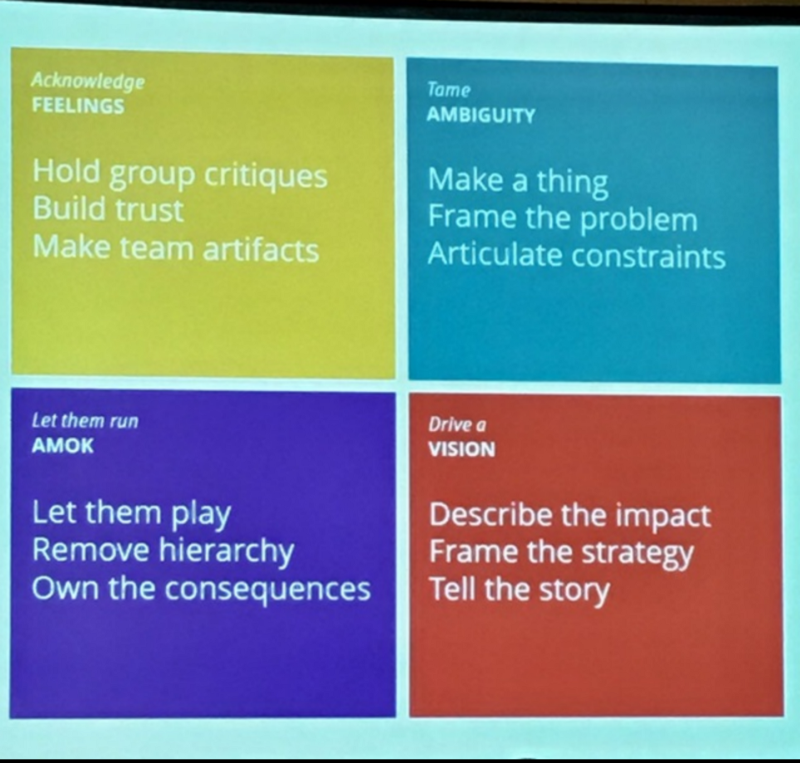
- Build trust within a team by holding group critiques and sharing artifacts.
- Constraints enable creativity as they frame the problem and provide a basis from which you can measure and iterate.
- Rules tell your team that “
is not okay.” They should be broken by all and the team lead should own the consequences. - Substantiate a problem’s framing with real data to explain why we are doing the work that we’re doing.
 Obligatory keynote summary slide ;)
Experience Streams in Cross-Channel Service Design: Leveraging Stats and Insights
Presented By: Alberto Ferreira
Engagement = mode x context x need
- Users navigate experiences in two modes:
- Telic (or, as Levitin calls it, task-positive)
- Paratelic (AKA task-negative)
- These modes can be broken up further into:
- Guided vs. Directed
- Motivated vs. Unmotivated
- Depending on the user’s affective state, they are more or less likely to make particular decisions.
- These decisions can be mapped into a decision tree, where different affectors inform every decision.
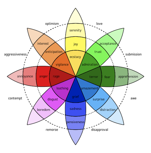
- User affection can be measured by affective mapping to Plutchik’s Wheel of Emotions — asking the user (and groups of users) what emotion a particular experience makes them feel
 Robert Plutchik’s Wheel of Emotions
More info on this methodology can be found on a blog post by Ferreira, “But how do you feel? The role of emotion in travel purchasing decisions”
How we (sort of) made UX and agile work — A case study
Presented by: Yael Keren
UX is a part of QA
- UX needs to always be 1–2 sprints ahead of the development team(s) sprints
- The UX team’s tasks during a given sprint can be broken up as follows:
- Validating the previous sprint
- Designing for the next sprint
- Supporting and QAing the current sprint
- By grouping sprints in “Product Increments” (a la SAFe), which is 3 “Sprints” + 1 “Planning Phase”, UX and Development is given time to review the progress made in the last 6 weeks as well as reorganize.
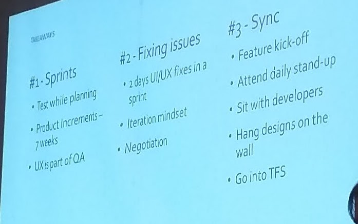
- UX is a part of QA! Convince the dev-team lead to dedicate at least one developer for at least one day to fix bugs and usability issues that were found within a given sprint, so that the release can be prepared with those problems accounted for and fixed.
- Attend the development team’s standup/scrum/daily meeting and sit next to them, so that you can be available to answer questions. This will catch problems early before they become a bug filed during QA.
 Takeaways slide (for easy reference)
Experience mapping: Your roadmap to successful applications
Presented by: Chris Hass (Jim Williams could not make it)
Everybody has a piece of the elephant, but nobody has the whole thing
- As people become more and more connected to various channels of B2C/B2B interaction, the line between products and services are blurred.
- A Journey Map can help explain the complete story of a particular user/customer/consumer/human within a given context
- Good Journey Maps bridge the chasms between teams, by aiding them in:
- Understanding and Communicating
- Identifying and Exploring
- Discussion and Prioritizing
- Insights from User Research provide the Goals, Needs, Behaviors, Motivations, and Passions of your Personas. These personas should be light on ambiguous details and demographics and heavy on behavior.
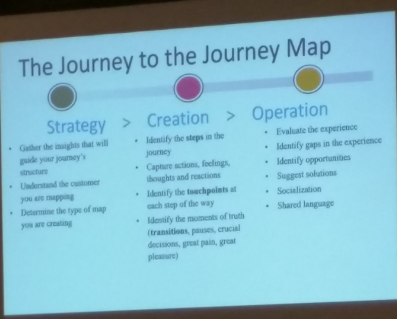
- Provide a map of the current experience and a map of the ideal. This will help codify your research, get everyone on the same page, and transition the conversation into designing solutions.
 The meta-slide
For examples and detailed instructions, see Mad*Pow’s UX Mastery Article: How to Create a Customer Journey Map
But wait… there’s more!
Tomorrow is another day, with much more learnings to come from it. I hope this post was helpful for reference (or learning, if you missed these talks)!
If you think I missed something important, summarized something wrong, or just want to start a relevant conversation… feel free to leave a comment, below!

